The background is now white instead of black. And the text is now made larger. I am quite pleased with the new layout. But would like your feedback. Which do you prefer? Please tell me.
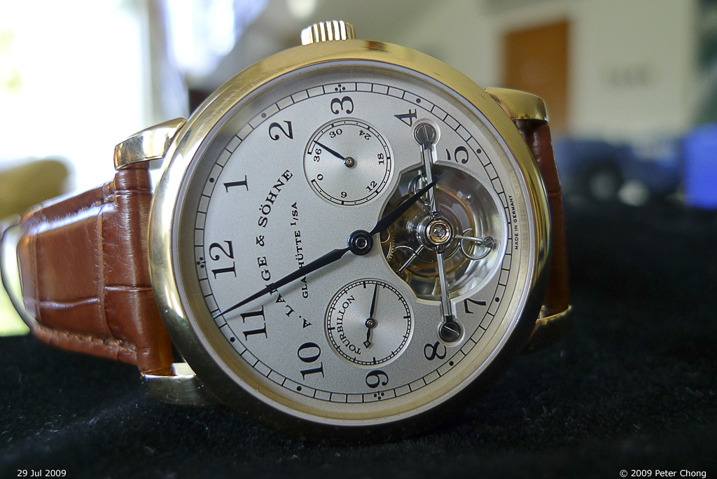
No food pics...but perhaps a pic of a dream watch...the Lange Pour le Merite Tourbillon. Owned by a friend.

7 comments:
Much prefer this new layout with white as overwhelming color. Gives more contrast that isn't that heavy on the eyes. Great picture of the watch too. Thanks for sharing...
Hi,
still prefer the black background, easier on the eye. The white sort of distract from the delicious food shown.
Whoaaaaaaaa!!!! My dream watch 2!
With the white background, the font colors of the links need some tweaking because they are too faint. But then again, too many colors will detract from the elegance of your website, so I vote black.
Much prefer the new layout with the white background. Much easier to read in my opinion.
I like this better.
prefer the old layout...but maybe i just need time to get use to the new one
Post a Comment